 how-to
Coordinating Home Decor for a Cohesive Look
Table of Contents
- Start With a Whole-Home Vision, Not a Room-by-Room Plan
- Your Interior Design Color Palette Guide: The 60-30-10 Rule
- How to Mix Decor Styles Without Creating a Hodgepodge
- Home Decor Mood Board Ideas for Digital Planning
- Balance Furniture Scale and Visual Weight in Open-Concept Spaces
- Tie Rooms Together With Transition Spaces and Architectural Details
- Coordinate Decor on a Budget: What to Splurge On and What to Skip
- Common Mistakes That Break a Cohesive Look
- Conclusion: Your Roadmap to a Unified, Curated Home
- Frequently Asked Questions
Last Updated: September 8, 2026
Start With a Whole-Home Vision, Not a Room-by-Room Plan
Coordinating home decor for a cohesive look starts long before you buy a single vase or throw pillow. The most common mistake is decorating each room in isolation, which produces lovely spaces that feel disconnected. A cohesive home reads as one continuous design story, where each room flows naturally into the next.
The solution is to establish your whole-home vision first, deciding on the overall mood, color story, and design language before making any purchases. When you know exactly what you're looking for, you stop buying impulse items that clash with everything else you own.
Define Your Personal Design Style First
Before you can coordinate anything, you need to know what you're drawn to. Spend time identifying your personal design style by browsing inspiration online, saving images that resonate, and noticing patterns in what you love.
Most people gravitate toward a blend of styles, which is fine. The goal isn't to label yourself but to identify the common thread running through your preferences, then filter every potential purchase through it.
Your Interior Design Color Palette Guide: The 60-30-10 Rule
A well-executed interior design color palette guide will save you from the most common decorating mistake: buying accent pieces in colors that fight each other for attention. The 60-30-10 rule is a simple ratio that keeps any room balanced. Sixty percent of the room should be your dominant color, usually walls and large furniture. Thirty percent should be a secondary color for upholstery, rugs, and window treatments. The remaining ten percent is reserved for accent hues in accessories, art, and decor.
This framework works because it gives your eye a clear hierarchy: dominant color first, secondary color second, and accents as delightful details, not competing focal points.
Choosing a Neutral Base That Flows Room to Room
Your neutral base is the glue that holds your whole home together. Rather than choosing a different neutral for every room, select one or two that can travel throughout the house. A warm greige or soft cream used consistently on walls or large furniture creates a seamless backdrop that makes coordinating home decor across rooms feel effortless.
Selecting Accent Hues That Feel Intentional
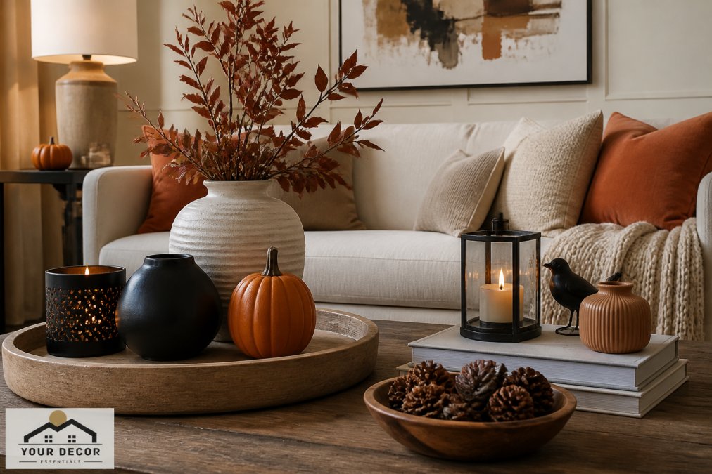
Once your neutral base is established, accent hues become your signature. Choose two or three accent colors and commit to them throughout the house. This doesn't mean every room needs all three, but repeating them in different proportions creates a thread of continuity. A deep terracotta might appear as a statement chair in the living room, throw pillows in the bedroom, and a ceramic vase in the entryway.
How to Mix Decor Styles Without Creating a Hodgepodge
The fear of creating a hodgepodge stops many people from mixing styles, leaving homes feeling sterile. But a curated home almost always blends influences. The secret is to ensure each piece shares at least one common element, color, material, or silhouette.
A modern sectional can live alongside a rustic wooden coffee table if both share a similar wood tone or complementary palette. Limit distinct styles to two or three so the mix feels deliberate rather than accidental.
Create a Focal Point in Every Room
Every room needs one moment that anchors the eye, a fireplace, a large piece of abstract art, or a sculptural light fixture. Once established, arrange the rest of the room to support it, preventing visual chaos.
Repeat Key Motifs and Textures for Visual Flow
Visual flow happens when the eye moves comfortably from room to room without a jarring stop. Repeating a particular wood finish or texture like linen or boucle in multiple rooms creates a subtle rhythm that ties your home together.
Home Decor Mood Board Ideas for Digital Planning
Before you spend money, build a mood board, a visual collection of your color palette, furniture styles, textures, and accessories that helps you see how everything works together. Digital planning tools make this simple and free: create a dedicated folder and save images of rooms you love, pieces you're considering, and paint colors.
When laid side by side, patterns emerge. You'll quickly see if your style leans monochromatic or if you're drawn to warm vs cool tones, and you'll spot potential clashes before they cost you money.
Collecting Samples and Swatches That Work
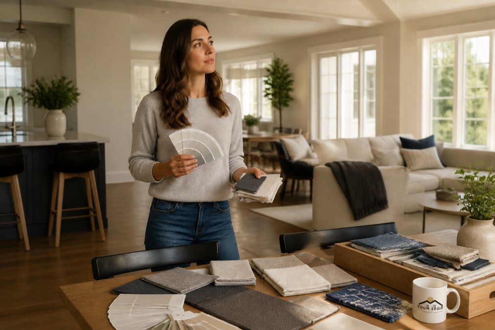
Digital planning has limits, which is why physical samples matter. Order fabric swatches, paint chips, and material samples before purchasing large items, and hold them against each other in the actual room where they'll live. This is the only reliable way to confirm that a warm wood sideboard complements the cool gray of your sofa.
Balance Furniture Scale and Visual Weight in Open-Concept Spaces
Open-concept spaces present a unique challenge because multiple zones share one visual field. The living area, dining area, and kitchen must all work together, and furniture scale becomes critical, a massive sectional can overwhelm a delicate dining set just a few feet away.
The goal is balance and proportion. If you have one large statement piece, balance its visual weight with equally substantial pieces elsewhere or define the zone with a large area rug. Furniture too small for a large space feels lost, while oversized pieces make the area feel cramped.
Tie Rooms Together With Transition Spaces and Architectural Details
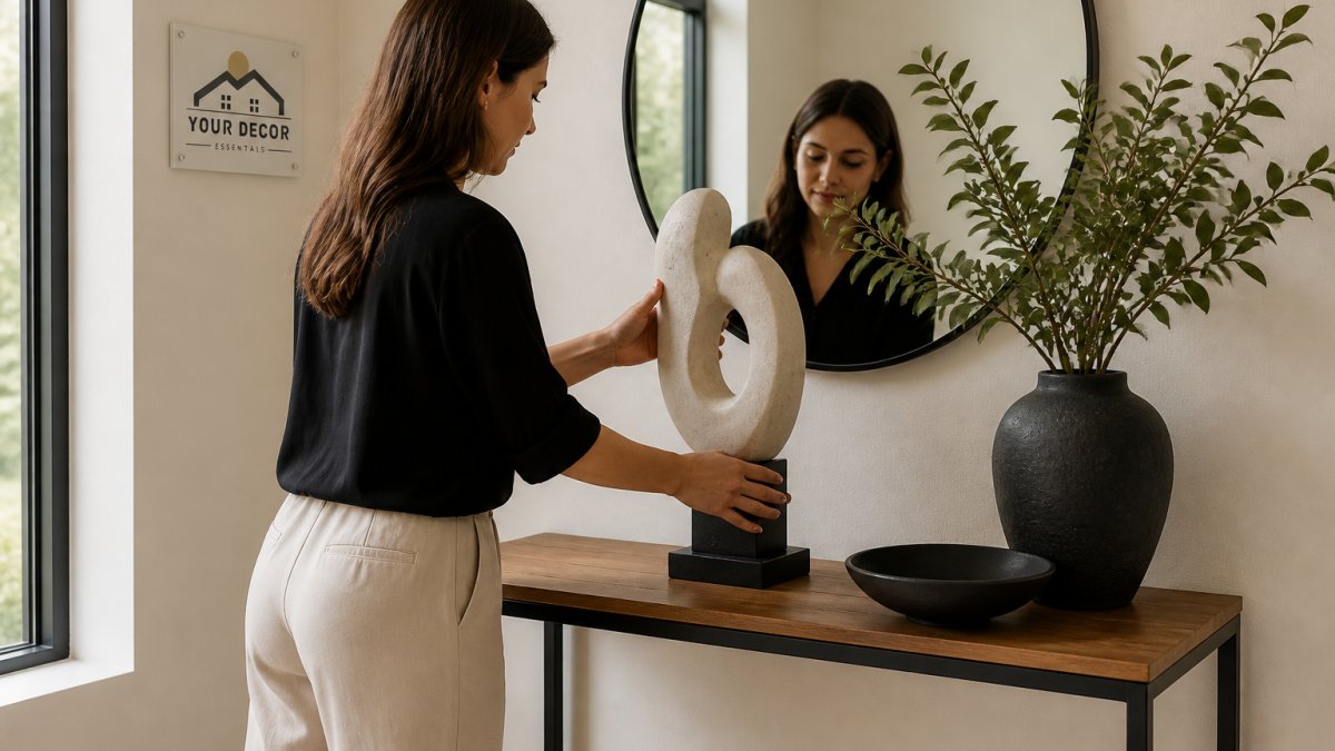
Transition spaces, hallways, entryways, and landings, are often ignored, breaking a home's cohesive flow. These spaces bridge the visual gap between rooms. A hallway console in the same wood tone as your living room furniture, or a runner picking up the adjacent bedroom's accent color, prepares the eye for what's next.
Architectural details also play a role. If you have crown molding, wainscoting, or distinctive door frames, echo those details in your decor choices. Even the finish of door hardware and light switch plates contributes, consistent finishes throughout are a subtle but powerful part of a unified look.
Why Transition Spaces Matter More Than You Think
The reason transition spaces are so critical isn't just aesthetic, it's neurological. When you walk from a warm, earthy living room into a cool, gray-toned kitchen, your brain does extra work to reconcile the two color temperatures. This cognitive load is why a home with mismatched rooms feels subtly stressful even when each room is individually attractive.
A well-designed transition space acts as a visual bridge that reduces this load, giving your brain a moment to adjust. The result is a home that feels calmer and more restful, not minimalist, but free from constant visual problem-solving.
The Color Temperature Bridge
If your living room uses warm neutrals and your kitchen uses cool neutrals, the hallway between them is where you ease that transition. Use a wall color that sits between the two temperatures, a greige or warm gray, as a stepping stone. Alternatively, use decor objects containing both temperatures, like a cream vase with gray veining or art featuring both warm and cool tones.
The Sightline Test
Here's a practical exercise to identify where your transition spaces need work. Stand in your entryway and look down the longest sightline, through the living room, down the hall, into the kitchen. What does your eye land on first, a cohesive color story or a jarring contrast? Now walk that path slowly, noting every moment where your eye "hits a wall." Those are your transition failures.
Common failures include:
- A dark hallway between two light rooms, The sudden drop in light levels feels like a tunnel. Fix it with a mirror to bounce light or a light wall color.
- A bold accent wall visible from the next room, The color bleeds into the adjacent space and creates an unintended clash. Soften it with a transition piece in the neutral color of the next room.
- A change in flooring material at a doorway, If you have hardwood in one room and tile in another, the line where they meet is a visual stop. A runner that spans the threshold can bridge the two.
The Hardware Consistency Principle
One of the cheapest ways to create cohesion is to standardize your hardware finishes. Walk through your home and note every doorknob, cabinet pull, light switch plate, and faucet finish. If you have brass in the living room, chrome in the kitchen, and oil-rubbed bronze in the bathroom, they're fighting each other every time you move between rooms.
You don't need to replace everything at once. Start with the most visible items, entry door hardware, kitchen cabinet pulls, and light switch plates. Replacing them in a consistent finish (matte black is the most forgiving for hiding fingerprints) creates a subtle but powerful thread of consistency.
The 3-Foot Rule for Transition Decor
When decorating a hallway or landing, apply the 3-foot rule: every item should be visible from at least 3 feet away and share a color, material, or finish with at least one item in each of the two rooms it connects. A console in the living room's wood tone, topped with a bowl in the kitchen's accent color, creates a visual handshake between the spaces.
The Psychological Payoff of Visual Flow
When your transition spaces work correctly, the payoff is more than a prettier home. Environmental psychologists have found that visual clutter and abrupt contrasts can elevate cortisol levels, while smooth visual flow promotes calm and control. This is why a cohesive home feels like a sanctuary, it gives your brain a break from constant visual problem-solving.
By treating hallways and entryways as intentional design elements rather than afterthoughts, you're creating a home that actively supports your well-being.
Coordinate Decor on a Budget: What to Splurge On and What to Skip
Achieving a cohesive look doesn't require a full-scale renovation or unlimited budget. Splurge on large, permanent pieces you'll live with for years, sofa, dining table, area rugs, since these anchor the room and set the tone.
Skip expensive versions of items that are easy to change. Throw pillows, vases, and decorative accessories can be budget-friendly finds where you experiment with accent colors and trends without a huge commitment.
The Real Budget Problem: Unifying What You Already Own
Most budget advice assumes you're starting from scratch. The harder, more common problem is that you already own a hodgepodge of furniture from college, hand-me-downs, or impulse buys. You don't need new pieces, you need a strategy to make the mismatched items you have look intentional.
The unifying power of a single finish. If you have a walnut media console, a pine bookshelf, and an oak coffee table, the wood tones will always fight each other. Unify them with a single finish. A can of dark walnut gel stain can transform a thrifted pine piece into something that belongs in the same family as your walnut console. Gel stain is forgiving for beginners, no stripping required, just light sanding and a clean surface.
The two-can spray paint rule. For metal furniture, lamp bases, side tables, chair frames, choose one metallic finish (matte black, brass, or nickel) and commit. A can of spray paint in your chosen finish can turn a mismatched brass floor lamp and a silver desk chair into a coordinated set. If it's metal and not your chosen finish, it gets painted.
Fabric as the great equalizer. Mismatched upholstered chairs are the easiest to unify. A single color of slipcover or a consistent throw blanket over each chair creates an instant visual connection. If you have a patterned sofa and a plain armchair, pull one accent color from the sofa's pattern and repeat it in a throw pillow on the armchair.
The 10% Rule for Accessories
When you're on a budget, resist buying a little of everything. Apply the 10% rule: for every $100 you spend on accessories, spend $90 on items that repeat a color, material, or finish you already own, and only $10 on experimental pieces. This builds on your existing palette rather than introducing elements that require more purchases to integrate.
Free and Nearly Free Cohesion Tricks
Rearrange before you buy. Before spending any money, try rearranging what you have. Moving a floor lamp from the bedroom to the living room might solve a lighting imbalance; swapping art between rooms can create a new color thread. A weekend of rearranging often reveals you already own enough to create cohesion, it's just distributed incorrectly.
The paint touch-up kit. A small investment in sample pots of your wall colors saves future frustration. When you buy a thrifted side table or new picture frame, paint it to match your existing trim or walls, instantly integrating it into the room's architecture.
Where to Actually Spend Your Next $100
If you have $100 to improve cohesion, here's the priority order most interior stylists recommend:
- A large area rug that pulls your palette together, A rug that contains 2-3 of your accent colors will anchor a mismatched furniture grouping better than any single piece of furniture.
- Coordinating throw pillows, Buy two or three in your accent colors, not one in each color you like.
- A can of paint in your wall color, For touching up scuffs and painting thrifted frames and small furniture.
- Matching lamp shades, Different lamp bases look intentional if they all wear the same style and color of shade.
Skip the decorative objects, the single statement vase, and the art print that doesn't match your palette. Those are the purchases that create the clutter you're trying to eliminate.
Common Mistakes That Break a Cohesive Look
Even with a solid plan, certain missteps can undermine your efforts. One frequent error is ignoring natural light, a color that looks perfect in a bright showroom can feel different in a dimly lit room. Always evaluate colors and materials in your own home's lighting.
Another mistake is buying everything from one place or collection, creating a showroom effect that lacks personality. A curated home mixes high and low, new and vintage. Finally, don't neglect the ceiling and floor, these large surfaces are part of your palette and should support your vision.
Conclusion: Your Roadmap to a Unified, Curated Home
A cohesive home isn't about perfection or matching sets. It's about intentional choices that reflect your personal style and create calm and harmony. Start with your whole-home vision, anchor it with a consistent color palette, and build each room with pieces that share a common language.
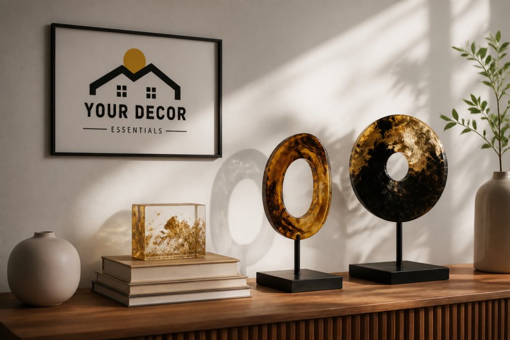
At Your Decor Essentials, our curated collection of abstract sculptures, resin accents, and functional lighting is designed to help you finish your home with the distinctive, artful details that make a space feel truly yours. Explore our selection to find the statement pieces that will tie your rooms together and reflect your unique taste.
Frequently Asked Questions
What is the 60-30-10 rule in interior design?
The 60-30-10 rule is a color balance guideline for coordinating home decor. It means 60% of a room should be your dominant neutral base (walls, large furniture), 30% should be a secondary color (rugs, curtains, upholstery), and 10% should be accent hues (pillows, art, decor accessories). This ratio prevents a space from feeling chaotic or too flat, ensuring a cohesive look that flows naturally.
How can I tie different rooms together with decor?
Tie rooms together by repeating a consistent color palette and a few key design elements throughout your home. Use a neutral base in adjoining rooms, then carry one or two accent hues and textures like wood or metal across spaces. In open-concept homes, maintain furniture scale and spatial alignment so sightlines stay clear. Transition spaces like hallways also bridge rooms when styled with matching decor accessories.
How do I make a home look cohesive without being matchy-matchy?
A cohesive look comes from harmony, not identical furniture sets. Mix decor styles by pairing a modern sofa with a vintage wood coffee table, then unify them with a shared color palette. Repeat a texture like linen or a motif like curved lines in different rooms. This creates visual flow and a design aesthetic that feels curated rather than copied from a catalog.
What is the best way to choose a color palette for my entire home?
Start with one neutral base that works in all your main living areas, then build your interior design color palette around it. Pick two to three accent hues you genuinely love and use them in varying proportions across rooms. Create a home decor mood board with paint swatches, fabric samples, and photos to test how warm vs cool tones interact before you commit.
Getting coordinating home decor for a cohesive look right comes down to planning and restraint. By establishing your vision and sticking to a consistent color story, you can avoid the frustration of mismatched rooms. Your Decor Essentials offers a curated range of unique pieces designed to add that final, personal layer to your home. Shop our collection to find the accents that will complete your space with style and intention.