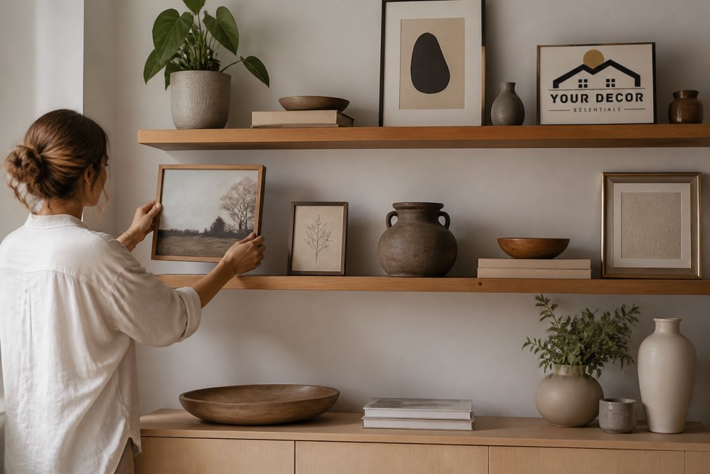
 how-to
How to Choose Art for Shelves: A Styling Guide
Table of Contents
- Assess Your Shelf Space and Visual Weight
- Determine the Best Art Sizes for Floating Shelves
- Build a Cohesive Color Palette and Mood
- How to Layer Art on Bookshelves
- Mixing Art and Decor on Shelves
- Select Frames That Complement Your Aesthetic
- Account for Weight, Safety, and Maintenance
- Common Mistakes When Choosing Art for Shelves
- Frequently Asked Questions
Last Updated: September 3, 2026
How to choose art for shelves is one of the most overlooked design decisions homeowners make. Most people grab whatever catches their eye and call it done. But the difference between a shelf that feels curated and one that looks cluttered comes down to a few deliberate choices about size, color, weight, and arrangement. This guide covers everything you need to know to choose art for shelves that actually works with your space, your aesthetic, and the other objects around it. Below, we'll show you exactly how to assess your shelf dimensions, select pieces that balance visually, layer them effectively, and avoid the most common styling mistakes.
Assess Your Shelf Space and Visual Weight
Before you buy a single piece, measure what you're working with. Shelf width, depth, and the vertical space above and below matter more than most people realize. A small 8-inch-wide floating shelf demands a completely different approach than a 48-inch built-in. The same piece can feel perfectly scaled in one context and overwhelming in another.
Visual weight is the perceived heaviness of an object, how much visual attention it demands regardless of its actual mass. A large dark abstract painting pulls the eye more than a small watercolor. A chunky sculptural piece reads as heavier than a thin metal frame. When you choose art for shelves, you're balancing these visual weights against the surrounding space and other objects.
The most important principle is proportion. Your art should occupy roughly one-third to two-thirds of your available shelf width. Smaller pieces work in clusters; larger statement pieces often stand alone. If your shelf is 36 inches wide, a single 12-inch-wide framed print feels too small and lonely. A 24-inch piece or a group of three 10-inch prints works better.
Consider the depth of your shelf too. Deeper shelves (10 inches or more) let you layer art and objects front-to-back, creating visual depth. Shallow shelves (4-6 inches) work best with flat frames or thin sculptures that don't jut out and create a cluttered appearance.
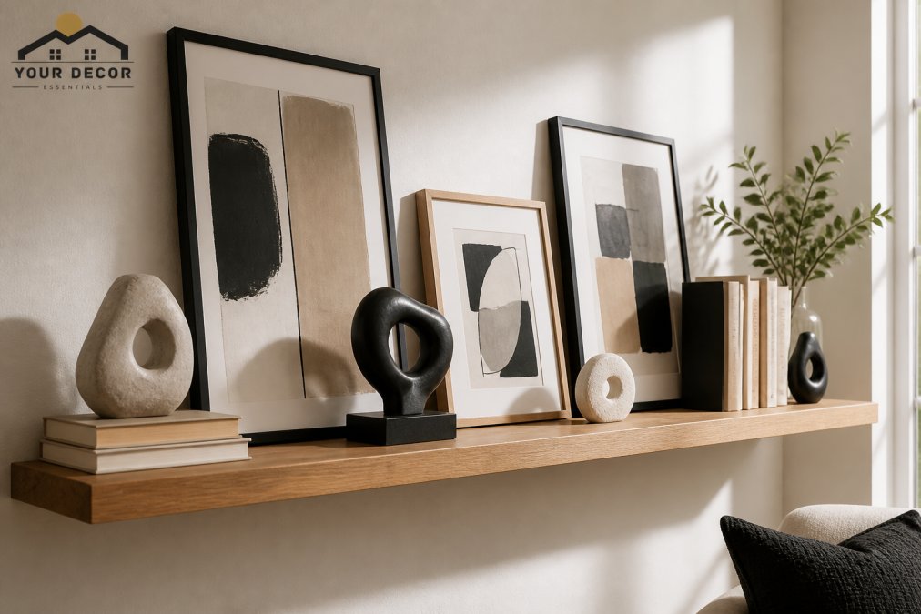
Think about negative space, the empty room around your art. Cramming every inch of shelf creates visual noise. Strategic emptiness gives your eye a place to rest and makes your chosen pieces feel intentional rather than random.
Determine the Best Art Sizes for Floating Shelves
The 2/3 Rule for Proportions
The most reliable formula for choosing art for shelves is the 2/3 rule. Your art (or art grouping) should occupy about two-thirds of your shelf width, leaving roughly one-third open. This creates visual balance without feeling sparse.
If your shelf is 36 inches wide, aim for art that totals 24 inches across. If it's 48 inches, target 32 inches. This isn't a hard law, it's a starting point that works more often than not.
For single large pieces, measure the frame width and make sure it fits comfortably without touching the shelf edges. Leave at least 2-3 inches of breathing room on each side. For multiple pieces grouped together, consider how they'll relate to each other. Three 10-inch frames grouped together occupy 30 inches of width (accounting for small gaps), which works perfectly on a 48-inch shelf.
Accounting for Visual Weight and Scale
Size alone doesn't determine whether a piece works. A small, dark, heavily textured abstract painting can feel visually heavier than a large, light, minimalist line drawing. When you choose art for shelves, match the visual weight to your composition.
Dark colors and complex compositions feel heavier. Light colors and simple designs feel lighter. A single bold statement piece can balance multiple smaller, lighter pieces. If you're placing a large dark abstract sculpture on one end of your shelf, you might balance it with a cluster of smaller, lighter framed prints on the other side.
The aspect ratio of your frames matters too. Horizontal (landscape) pieces feel grounded and stable. Vertical (portrait) pieces feel dynamic and draw the eye upward. Mixing both creates visual interest, but too many vertical pieces in a row can feel chaotic. A good mix is roughly 60% horizontal and 40% vertical, though this varies by your overall aesthetic.
Consider how your art relates to the wall behind it. If your wall is white or neutral, almost any art works. If your wall has texture, pattern, or color, choose art that complements rather than competes with it. A busy patterned wallpaper behind your shelf means simpler, more restrained art works better.
Build a Cohesive Color Palette and Mood
The colors in your art set the tone for your entire shelf display and the room around it. When you choose art for shelves, think about whether you want the shelf to feel calm and cohesive or bold and eclectic.
A monochromatic approach uses variations of one color, think multiple shades of blue, or a range of blacks, grays, and whites. This creates visual harmony and feels sophisticated. It's especially effective in minimalist or modern spaces. The eye doesn't jump around because the color story is consistent.
A complementary palette uses colors opposite each other on the color wheel, blues and oranges, greens and reds. This approach is bolder and more energetic. It works well if you want your shelf to be a focal point and you're comfortable with visual stimulation.
A monochromatic with accent is the middle ground. Stick mostly to one color family but introduce one contrasting accent color through a frame, mat, or sculptural piece. This gives you interest without chaos.
Think about the mood you want to create. Warm colors (reds, oranges, yellows) feel inviting and energetic. Cool colors (blues, greens, purples) feel calm and sophisticated. Neutral tones (blacks, grays, whites, natural wood) feel timeless and let other design elements shine. Your choice should align with the room's overall aesthetic and how you want the space to feel.
If you're working with pieces you already own, build your palette around them rather than trying to force everything to match. A cohesive shelf doesn't mean every piece is identical, it means the pieces relate to each other through color, style, or theme.
How to Layer Art on Bookshelves
Leaning vs. Hanging Techniques
Leaning art against the wall is the most forgiving approach, especially on bookshelves. It's temporary, adjustable, and doesn't require holes. Leaned pieces feel casual and intentional at the same time. They work particularly well when you want to change your display seasonally or frequently.
When you lean art, tilt it at a slight angle, about 15 degrees, so it sits securely against the wall without looking like it might slip. Make sure the frame's bottom edge rests firmly on the shelf surface. Heavier pieces should lean more steeply; lighter pieces can be nearly upright.
Hanging art on a shelf is less common but creates a more permanent, curated look. It requires small nails or picture hooks mounted into the wall above the shelf. Hung pieces feel more formal and gallery-like. Use this approach when you want a polished, intentional display that won't change frequently.
The choice between leaning and hanging depends on your comfort level with wall modifications and how permanent you want your display to be. Renters often prefer leaning. Homeowners who like changing their decor might lean pieces even if they could hang them.
Creating Depth with Overlapping Pieces
Depth transforms a flat shelf display into something visually interesting. The most effective way to create depth when you choose art for shelves is to overlap pieces, place smaller items in front of larger ones, or lean one frame partially in front of another.
Overlapping doesn't mean cluttering. A single large framed print leaned against the wall with a smaller frame or small sculpture positioned in front of it creates intentional layering. The front piece draws the eye first; the back piece adds dimension.
Vary the heights of your pieces. A tall frame standing upright next to a leaned landscape frame creates visual rhythm. A small sculpture positioned in front creates a third layer. Books stacked at different heights add another dimension. The goal is to create a composition where your eye travels through the display rather than taking it all in at once.
Leave gaps between pieces so you can see the wall behind them. This prevents the display from feeling packed and maintains the sense of intentional curation.
Mixing Art and Decor on Shelves
Balancing Frames, Sculptures, and Objects
Art doesn't exist in isolation on a shelf. Books, sculptures, plants, candles, and other decorative objects share the space. When you choose art for shelves, you're really choosing how all these elements work together.
Think of your shelf as a composition with multiple players. Frames are typically the visual anchors, they command attention and set the aesthetic tone. Sculptures add three-dimensional interest and tactile appeal. Books provide color, texture, and height variation. Smaller objects like candles or plants fill gaps and add personality.
The key is intentional distribution. Don't cluster all your art on one side and all your objects on the other. Distribute them so your eye moves across the entire shelf. A frame, then books, then a sculpture, then more negative space, then another frame creates better rhythm than grouping by category.
Consider the textures you're mixing. Smooth frames, rough sculptural pieces, matte and glossy finishes, natural materials like wood and metal, variety in texture makes a display feel curated rather than generic. Abstract sculptures from Your Decor Essentials, for instance, often feature interesting surface qualities that complement flat framed art.
The 70/30 Rule for Composition
A useful framework is the 70/30 rule: dedicate roughly 70% of your shelf space to art (frames, prints, sculptures) and 30% to functional or decorative objects (books, plants, accessories). This ratio ensures your shelf feels intentional and curated without becoming a gallery installation.
In practice, this means if you have a 48-inch shelf, about 34 inches should feature art-focused pieces, and 14 inches can house books or other objects. This isn't rigid, adjust based on your personal style and what you actually own.
Some people prefer a more minimalist 80/20 split, with less functional clutter. Others like a busier 60/40 or 50/50 composition. The 70/30 rule is a starting point that works for most people.
The arrangement matters as much as the ratio. Cluster your art pieces rather than spreading them out evenly. Group books together in a stack rather than scattering them. This creates visual zones and makes the display feel organized rather than random.
Select Frames That Complement Your Aesthetic
Frames are the border between your art and the room. The right frame enhances; the wrong frame competes with or detracts from the art inside.
Minimalist spaces call for clean, simple frames, thin black metal, natural wood, or white-painted frames. Ornate, decorative frames would feel out of place. The frame should be nearly invisible, letting the art take center stage.
Eclectic or maximalist spaces have more freedom. Mix frame styles, colors, and materials. A gold frame next to a natural wood frame next to a black metal frame creates visual interest. The variety becomes part of the aesthetic rather than a distraction.
Matting adds another layer of consideration. A mat separates the art from the frame and can change how a piece feels. White or cream mats feel classic and timeless. Colored mats can echo your color palette or add subtle contrast. No mat creates a more contemporary, direct look.
The frame color should relate to either your art, your wall, or your overall room palette. A frame that matches your wall color makes the art float and feel more prominent. A frame that matches accent colors in your art creates cohesion. A frame that contrasts with everything can work as a bold statement, but use this sparingly.
Consistency in framing creates a sense of intentionality. If most of your pieces are in simple black frames, one ornate gold frame stands out as a deliberate choice rather than an accident. If you're mixing frame styles, make sure they share some common thread, similar depth, similar finish, or similar aesthetic era.
Account for Weight, Safety, and Maintenance
Shelves have weight limits, and exceeding them is both dangerous and damaging. Before you load up your display, know your shelf's capacity. Floating shelves typically support 25-50 pounds depending on the wall construction and hardware. Bookshelves vary widely based on materials and support structure.
When you choose art for shelves, account for the combined weight of frames, sculptures, books, and everything else. A large heavy wooden frame plus multiple books plus sculptures can add up quickly. If you're uncertain, err on the side of lighter pieces or fewer pieces.
Heavier items should be positioned closer to the wall (where shelves are typically best supported) rather than at the edges. Large sculptures should sit toward the back. Books should be stacked rather than spread out to distribute weight more efficiently.
Dust accumulates on shelves and on art. Framed pieces need occasional gentle dusting with a soft cloth. Sculptures with textured surfaces trap more dust. Resin pieces like those from Your Decor Essentials can be wiped clean with a slightly damp cloth if needed, but check manufacturer guidance first. Plan for maintenance as part of your display strategy, if you hate dusting, avoid heavily textured pieces or consider a display you can easily adjust.
Seasonal rotation keeps your space feeling fresh without major redecoration. Swap out art seasonally, change your color palette with the seasons, or rotate sculptures and frames every few months. This approach also lets you protect delicate pieces from long-term dust and light exposure.
Common Mistakes When Choosing Art for Shelves
The most common mistake is choosing pieces individually without considering how they'll relate to each other. You see a frame you love, buy it, then see another and buy that too. Six months later you have six unrelated pieces that don't work together. Instead, start with a color palette or aesthetic theme and choose pieces that fit it.
Another frequent error is ignoring scale. A tiny frame on a large shelf feels lost. A massive piece on a small shelf feels overwhelming. Measure your shelf before shopping, and keep those dimensions in mind.
Overcrowding is rampant. People fill every inch of shelf space because they want to use the space they have. But empty space is not wasted space, it's essential to making your display feel intentional. Resist the urge to fill every gap.
Mixing too many styles without a unifying thread creates visual chaos. A modern minimalist frame next to an ornate vintage frame next to a rustic wooden frame can work, but only if they're intentionally combined as part of an eclectic aesthetic. If it happens by accident, it reads as disorganized.
Neglecting the wall behind the shelf is another oversight. Your art exists in context. A busy patterned wallpaper behind your display competes with your art. A neutral wall lets your pieces shine. If your wall is already patterned or colored, choose simpler art that complements rather than fights it.
Finally, many people choose art based solely on what they like in isolation, without considering the room's existing aesthetic. A beautiful piece that clashes with your furniture, your color scheme, or your overall style will feel out of place no matter how well-displayed. Art should enhance your space, not fight it.
Choosing art for shelves is ultimately about creating a composition that reflects your taste while respecting the principles of proportion, color, and balance. The process takes intention, but it's far more achievable than many people think. Start by assessing your space, establish a color palette, and build your display thoughtfully rather than randomly.
Your Decor Essentials offers a curated selection of unique abstract sculptures and resin accents specifically designed to elevate shelf displays and create visual interest in any room. Our pieces are chosen for their ability to work alongside frames and other decor objects, creating sophisticated, personalized interiors. Explore our collection to find statement pieces that transform your shelves from functional storage into a reflection of your individual style. Shop Now to discover how the right art and decor can completely change how your space feels.
Frequently Asked Questions
What is the 2/3 rule for hanging art on shelves?
The 2/3 rule suggests that artwork should occupy approximately two-thirds of your available shelf space, leaving one-third for negative space or other decor elements. This creates visual balance and prevents shelves from feeling overcrowded. Apply this principle by measuring your shelf width and calculating the combined width of your art pieces to ensure they don't exceed the two-thirds threshold, allowing your curated selection to breathe.
How do you balance art with other decorative objects when choosing art for shelves?
Use the 70/30 composition rule: allocate 70% of shelf space to your primary focal elements (art and statement pieces) and 30% to supporting decor objects like small sculptures or functional items. This prevents visual clutter while maintaining interest. Alternate between vertical and horizontal orientations, vary heights, and intersperse decorative objects between artwork to create rhythm and depth throughout your display.
Should art on shelves be framed or unframed?
Both work, depending on your aesthetic and the piece itself. Framed art provides a finished, cohesive look and protects delicate works, while unframed or canvas pieces add modern, casual appeal. Consider your overall style: minimalist spaces benefit from clean frames or unframed work, while eclectic displays can mix both. Ensure frames complement your color palette and don't compete with the artwork itself for visual attention.
What is the best way to layer art on bookshelves without it looking cluttered?
Start with a focal point piece, then layer supporting artwork behind or beside it using leaning and hanging techniques. Create depth by varying distances from the shelf edge, some pieces leaning forward, others recessed. Maintain consistent spacing between elements, use negative space strategically, and ensure visual weight is distributed evenly across the shelf. This approach builds composition and prevents the arrangement from feeling cramped or chaotic.
This article was written using GrandRanker
Frequently Asked Questions
What is the 2/3 rule for hanging art on shelves?
The 2/3 rule suggests that artwork should occupy approximately two-thirds of your available shelf space, leaving one-third for negative space or other decor elements. This creates visual balance and prevents shelves from feeling overcrowded. Apply this principle by measuring your shelf width and calculating the combined width of your art pieces to ensure they don't exceed the two-thirds threshold, allowing your curated selection to breathe.
How do you balance art with other decorative objects when choosing art for shelves?
Use the 70/30 composition rule: allocate 70% of shelf space to your primary focal elements (art and statement pieces) and 30% to supporting decor objects like small sculptures or functional items. This prevents visual clutter while maintaining interest. Alternate between vertical and horizontal orientations, vary heights, and intersperse decorative objects between artwork to create rhythm and depth throughout your display.
Should art on shelves be framed or unframed?
Both work, depending on your aesthetic and the piece itself. Framed art provides a finished, cohesive look and protects delicate works, while unframed or canvas pieces add modern, casual appeal. Consider your overall style: minimalist spaces benefit from clean frames or unframed work, while eclectic displays can mix both. Ensure frames complement your color palette and don't compete with the artwork itself for visual attention.
What is the best way to layer art on bookshelves without it looking cluttered?
Start with a focal point piece, then layer supporting artwork behind or beside it using leaning and hanging techniques. Create depth by varying distances from the shelf edge—some pieces leaning forward, others recessed. Maintain consistent spacing between elements, use negative space strategically, and ensure visual weight is distributed evenly across the shelf. This approach builds composition and prevents the arrangement from feeling cramped or chaotic.