 how-to
9 Tips for Creating a Cohesive Interior Design Style
Last Updated: November 8, 2026
Quick Summary
A cohesive interior starts with one design vision you can state in a single sentence, then repeat a small palette and a few materials in every room. Pick three to five colors, two or three finishes, and one accent, and use them at different strengths and scales throughout the home.
- Write a one-sentence design vision before you shop and filter every purchase against it.
- Build a mood board of ten to fifteen images and look for what repeats.
- Use a whole house palette of three to five colors at different strengths in every room.
- Keep roughly 70 percent neutral base and 30 percent accent color per room.
- Repeat two or three finishes in at least three rooms each, varying scale not material.
Table of Contents
- Start With One Design Vision, Not Nine
- Build a Whole House Color Palette That Travels
- How to Make a Home Flow From Room to Room
- How to Mix Interior Design Styles Without the Clash
- Repeat Materials, Finishes, and Textures on Purpose
- Use a Recurring Motif to Tie Rooms Together
- Cohesive Design Examples You Can Copy Room by Room
- Fix the Layout Before You Style It
- Common Cohesive Design Mistakes and How to Fix Them
- Shop Your Next Statement Piece With a Plan
- Frequently Asked Questions
Start With One Design Vision, Not Nine
A cohesive interior starts with a single design vision you can state in one sentence. Most first-time homeowners skip this step. They buy room by room, piece by piece, and end up with a house that feels like nine separate apartments.
A beautiful lamp here, a great sculpture there, and nothing talks to anything else is a common pattern in homes furnished one piece at a time.
So before you shop, write down your vision. It can be as simple as:
- "Warm, calm, and a little sculptural."
- "Modern with old-world texture."
- "Light, airy, and full of natural materials."
That one line becomes your filter. Every piece you bring home either supports it or fights it.
The basics of interior design principles
Build a Mood Board Before You Buy Anything
A mood board is a collection of images, colors, and textures that captures the feeling you want. It is the cheapest design tool you own.
Gather ten to fifteen images. Look for what repeats. If the same warm wood and soft cream show up again and again, that is your palette talking. If half your images are moody and half are bright, your vision needs narrowing.
Pin your mood board where you can see it while you shop online. It stops impulse buys that clash.
Build a Whole House Color Palette That Travels
A whole house color palette is three to five colors used in every room at different strengths. This is the backbone of any cohesive interior. Pick your colors once, then repeat them everywhere.
Start with one neutral you love. Add one deeper tone and one accent. Then let each room lean on those same colors in different amounts.
The trick is undertones. A gray with a warm undertone will fight a cool gray every time. Hold your samples together in daylight before you commit.
Color theory and harmony guidance
The 70/30 Rule for Neutral Base and Accent Colors
The 70/30 rule keeps a palette from feeling flat. Roughly 70 percent of a room should be your neutral base, and about 30 percent should be accent color.
So a living room might be 70 percent cream walls, sofa, and rug, with 30 percent rust cushions, art, and a resin accent piece. The ratio gives the eye somewhere to rest and somewhere to land.
Flip the ratio and the room feels loud. Skip the accent and it feels unfinished. Keep the same 70/30 split in every room and the whole home reads as one design.
How to Make a Home Flow From Room to Room
Room-to-room flow comes from repeating a few elements in every space, then checking how those elements read from every doorway. You do not need identical rooms. You need common threads the eye can follow and a sequence for placing them.
Start with three repeat elements you can name out loud:
- A metal: brass, black steel, or brushed nickel, used in lighting and hardware.
- A wood tone: the same warm oak or walnut showing up in furniture legs and frames.
- A color: one accent that appears in every room, even in small doses.
Then apply them in a fixed order so you are not guessing room by room:
- Walk the sightlines first. Stand in your main hallway, then at each doorway, and photograph what you see. Two or three sightlines often carry the whole home, usually entry to living room, living room to dining or kitchen, and hallway to bedroom doors.
- Place the repeat elements where sightlines cross. Put your metal on a visible lamp or cabinet pull, your wood on a console or table leg, and your accent color on a cushion, tray, or piece of art that shows from the doorway.
- Vary the scale, not the element. The same brass can appear as a floor lamp in one room and a small sculpture base in the next. Same finish, different job.
- Check the transition, not just the room. The threshold between rooms is where flow breaks. Repeat one element on both sides of every doorway, a wood tone on the console in the hall and the coffee table in the living room, or the same accent color on a hallway runner and a living room throw.
Wall texture helps here too. A wood slat acoustic panel carries grain and warmth from one room to the next, which is exactly what wood slat acoustic panels are made for.
Open-plan layouts and small homes need this most. Use rugs to define zones, then repeat materials across zones so the open space still reads as one room. In a studio or small apartment, pick one sightline, usually from the entry, and make sure every zone visible from that point shares at least two of your three repeat elements.
Watch out: repeating an element in every room at the same scale turns cohesion into a catalog look. Change the size and the job, not the material or color.
For renters, focus on what you can move: rugs, lighting, art, and freestanding pieces. None of it requires a drill, and all of it can carry a repeat element from room to room.
How to Mix Interior Design Styles Without the Clash
Mixing interior design styles works when one style leads and the others follow. The mistake is giving every style equal weight. That is how rooms end up looking confused.
Choose a primary style, then add one secondary style for contrast. A modern room with a single antique piece feels curated. A modern room with five antique pieces feels like a showroom.
Keep proportions in check. One large statement, a few medium pieces, and small accents. Too many small items create visual noise.
And repeat a material across styles. If your modern sofa is bouclé, bring a bouclé cushion into the traditional armchair. That shared texture is the bridge.
Repeat Materials, Finishes, and Textures on Purpose
Visual continuity comes from repeating materials, not just colors. This is the part most guides miss. A home feels designed when the same finishes show up in unexpected places.
Try this pattern:
- Choose two or three finishes for the whole house.
- Use them in at least three rooms each.
- Vary the scale, not the material.
So brass appears on a floor lamp in the living room, a cabinet pull in the kitchen, and a small sculpture base in the bedroom. Same finish, different jobs.
Texture does the same work. Mix a smooth resin accent with a nubby throw and a matte ceramic vase. The contrast keeps a neutral room from feeling flat.
For more on making one bold piece a repeated star, see our guide on how to style sculptural floor lamps as statement decor.
Use a Recurring Motif to Tie Rooms Together
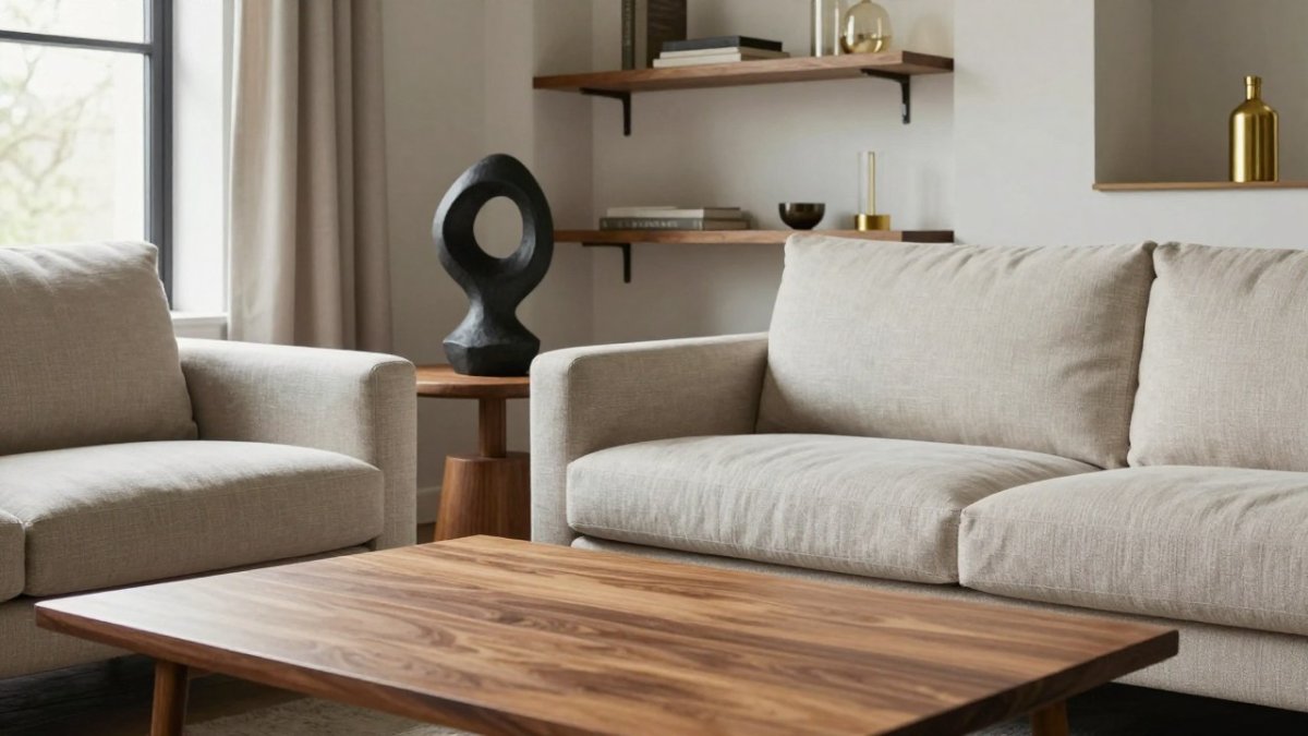
A decorative motif is a shape, theme, or detail that repeats through the home. It can be a curve, a geometric form, or a repeated abstract silhouette.
Abstract sculptures are a natural fit. One organic form in the entry, a smaller version on a bookshelf, and a related shape on a side table create a thread without shouting.
Artwork can carry the motif too. A repeated color block or line in your framed prints ties the walls together.
The goal is recognition, not repetition. A guest should feel the pattern without being able to name it. Our guide on how to style abstract home sculptures like a designer shows how to place them so the motif reads as intentional.
Cohesive Design Examples You Can Copy Room by Room
Here is a worked example you can copy in a weekend. It uses one palette, one metal, one wood tone, and one accent color so the whole home connects. Treat it as a template: swap the specific colors and materials for your own, but keep the sequence and the ratios.
The palette: a warm cream neutral, a deeper clay tone, and one rust accent. Three colors, used at different strengths in every room.
The material plan: warm oak for wood, brass for metal, and one textured element, a nubby throw or matte ceramic, to keep neutrals from feeling flat.
Now apply it room by room in this order, because the entry sets the tone everything else echoes:
The entry: an oak console, a brass tray, and one small rust accent. This is the first sightline, so it must carry all three repeat elements. If you rent, use a freestanding console and a removable hook strip instead of wall-mounted hardware.
The living room: a cream sofa, two clay cushions and one rust cushion, a brass floor lamp, and a coffee table in the same oak as the entry console. Keep roughly 70 percent neutral, 30 percent accent so the eye has somewhere to rest and somewhere to land.
The bedroom: the same cream bedding, one clay throw, a smaller abstract piece on the nightstand, and the same brass on a reading lamp. Scale down, the bedroom should feel like a quieter version of the living room, not a copy.
The bathroom: the same brass on the faucet and towel hooks, plus a textured tray in the clay tone. This is the smallest room, so one repeat element per surface is enough.
Notice the pattern: same oak, same brass, same rust accent, different scale and different job in each room. That is what makes the home read as one design instead of four.
For awkward floor plans, apply the same sequence to the transition zones. A narrow hallway gets one repeat element, usually the wood tone on a slim console or the accent color on a runner, so it connects the rooms on either side without becoming a room of its own. In an open-plan layout, assign each zone one dominant repeat element and let the others appear in small doses, so the zones read as separate without breaking the whole.
Copying the example too literally can produce a matchy result. If every room has the same three elements at the same strength, vary the ratio, let one room lean more neutral and another carry more accent, while keeping the undertones consistent.
For more on making one bold piece a repeated star, see our guide on how to style sculptural floor lamps as statement decor.
Fix the Layout Before You Style It
No amount of styling fixes a bad layout. Before you hang art or place a single sculpture, get the furniture right.
Start with function. How do you actually use the room? If the sofa blocks the walkway to the kitchen, move it. If the floor lamp crowds the reading chair, shift it.
Then check your sightlines again. The best focal point in a room should be visible from the doorway. That might be a fireplace, a large artwork, or a statement sculpture on a console.
Small homes and open-plan layouts need this most. Use rugs to define zones, and repeat materials across zones so the open space still feels like one room.
For renters, focus on what you can move: rugs, lighting, art, and freestanding pieces. None of it requires a drill.
Common Cohesive Design Mistakes and How to Fix Them
The most common cohesive design mistake is buying pieces in isolation. A lamp that looks great online can clash with everything you own. Fix it by checking every purchase against your mood board first.
The second mistake is too many focal points. If every wall has a statement, nothing stands out. Fix it by choosing one hero piece per room and letting the rest support it.
The third mistake is ignoring scale. A tiny sculpture on a huge console disappears. A large one on a small side table overwhelms it. Match the piece to the surface.
The fourth is mixing too many metals. Two finishes is plenty. Three starts to look accidental.
Before you buy a replacement piece, learn how to verify home decor quality before you buy so you fix the problem instead of repeating it.
Room layout and furniture arrangement basics
Here are the most common mistakes that break cohesion, and the fix for each one.
| Mistake | Fix |
|---|---|
| Buying pieces in isolation | Check every purchase against your mood board first |
| Too many focal points | Choose one hero piece per room |
| Ignoring scale | Match the piece to the surface |
| Mixing too many metals | Stick to two finishes |
Shop Your Next Statement Piece With a Plan
A statement piece should earn its place. Before you buy, run it through a simple checklist:
- Does it match at least two colors on my mood board?
- Does it repeat a material or finish I already use?
- Is the scale right for the surface it will sit on?
- Does it support my one-sentence vision?
- Can I picture it in at least two rooms?
If you answer yes to four or more, it belongs in your home. If not, keep looking.
Every abstract sculpture, resin accent, and functional lighting piece in a curated selection is meant to add visual interest.
A curated selection suits people who want a home that feels personal rather than mass-produced. If you are ready to shop with a plan, our guide on buying high quality decor online walks you through what to check before you commit.
Building a cohesive interior takes one clear vision and the discipline to repeat it. That is where Your Decor Essentials comes in. Our curated collection of abstract sculptures, resin accents, and functional lighting is designed to repeat across rooms and tie your whole home together. Start with one piece that matches your palette, then build from there.
Frequently Asked Questions
What does cohesive interior design actually mean?
Cohesive interior design means the rooms in your home feel related, not identical. A cohesive interior shares a color palette, repeats a few materials or finishes, and keeps sightlines in mind so one room leads naturally into the next. It is not about buying a matching set for every space. The goal is visual continuity: a guest should be able to walk from your entryway to your bedroom and sense the same taste at work, even though each room serves a different function.
How do you choose a whole house color palette without it feeling flat?
Pick one neutral base you can live with in every room, then choose two or three accent colors that appear in different amounts across the house. A common approach is the 70/30 rule: roughly 70 percent neutral, 30 percent accent and contrast. Keep undertones consistent so warm grays do not sit next to cool grays in adjacent rooms. You can vary the intensity room by room, using a deeper shade of the same accent in a den and a lighter version in a hallway, which keeps things interesting without breaking the palette.
How can you mix interior design styles and still make a room feel cohesive?
Anchor the room with one dominant style, then add pieces from a second style in smaller doses. A traditional sofa with a modern abstract sculpture and a mid-century side table works because the shared thread, such as warm wood tones or a repeated metallic finish, ties them together. Limit yourself to two or three styles per room and repeat at least one material or color across every piece. The mistake is giving each item equal weight, which reads as clutter rather than contrast.
How do you make a home look cohesive when your tastes are different from your partner's?
Build a shared mood board and agree on the non-negotiables first: the base wall color, the main furniture finish, and one accent metal. Then each person gets a zone or a category to express their taste, such as artwork or lighting. Repeat the agreed elements in every room so both styles have a common thread. This approach lets one person lean toward sculptural, abstract pieces while the other favors clean lines, and the home still reads as one considered space rather than two competing ones.