 how-to
How to Coordinate Home Decor Pieces: A 2026 Guide
Table of Contents
- What You'll Need Before You Start
- Choosing a Color Palette for Home Decor
- How to Mix and Match Home Decor Styles
- Balancing Textures, Materials, and Visual Weight
- Grouping and Arranging Your Decor Pieces
- How to Arrange Decor on a Coffee Table
- Using Lighting as a Coordination Tool
- Coordinating Home Decor Pieces on a Budget
- Common Mistakes to Avoid When Coordinating Home Decor Pieces
- Frequently Asked Questions
Last Updated: September 12, 2026
What You'll Need Before You Start
Learning how to coordinate home decor pieces is less about buying a matching set and more about training your eye. This guide from Your Decor Essentials walks through the color, texture, and arrangement decisions that make a room feel intentional, even when every piece came from a different place.
Gather these before you move a single object:
- A phone camera, for photographing arrangements from a distance
- A tape measure, for checking scale against furniture
- A tray or two, for grouping small items
- Painter's tape, for testing placement without commitment
- A notepad, for tracking what works and what doesn't
Here's the part most guides skip: you don't need new pieces to fix a mismatched room. You need a system for deciding where the ones you already own should live. That system starts with color.
Choosing a Color Palette for Home Decor
A home decor palette is a limited set of colors repeated across a room's furniture, textiles, and accents so the eye reads the space as one composition rather than a collection of purchases. Most rooms need three to five colors, not a dozen.
The 80/20 Rule of Design
The 80/20 rule of design means roughly 80% of a room should sit in neutral or base tones, with the remaining 20% reserved for accent color. Flip that ratio and a room starts to feel loud and unsettled.
In practice, that means your sofa, rug, and walls carry the neutral base while pillows, art, and small sculptures carry the color. This gives you room to swap accents seasonally without repainting anything.
Building a Neutral Base
Start with the largest surfaces, because they're the hardest to change later. Floors, walls, and upholstery set the foundation everything else answers to.
A common mistake is treating "neutral" as strictly beige or gray. Warm whites, soft taupes, and muted greens all work as a base if you hold them consistently across the big pieces. The accent layer is where personality enters, and that's exactly where a curated piece earns its place.
How to Mix and Match Home Decor Styles
Mixing home decor styles works when you pick one dominant style and let everything else support it at roughly 70/30. Two styles fighting for equal weight read as indecision; one leading and one accenting reads as taste.
Avoiding the Matchy-Matchy Look
The matchy-matchy look happens when every piece shares the same finish, era, and color. It photographs fine and lives poorly, because nothing in the room has a reason to catch your eye.
Break it up with contrast in one dimension at a time:
- Same color, different texture
- Same era, different material
- Same material, different scale
Change one variable per piece. Change three at once and you're back to a hodgepodge.
Balancing Textures, Materials, and Visual Weight
Visual weight is how much attention a piece pulls, and it comes from size, darkness, shine, and pattern density. A room feels calm when visual weight is distributed rather than clustered in one corner.
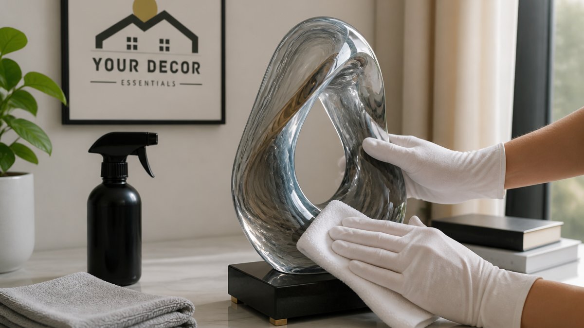
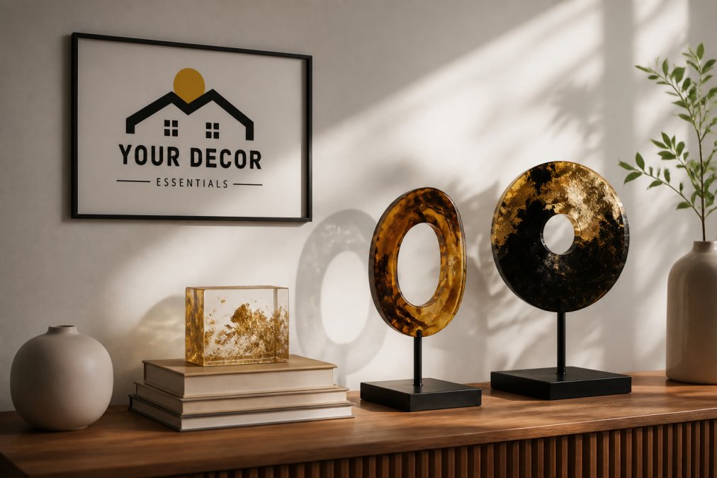
Balance a heavy, dark wood console with lighter elements nearby: an airy vase, a pale textile, a matte ceramic. Shiny surfaces carry more visual weight than matte ones at the same size, which is why a single glossy resin accent can hold a shelf on its own.
Layering textures is the fastest fix for a flat room. Combine something smooth with something rough, and something hard with something soft. Three textures in one arrangement is usually enough; more starts to compete.
Grouping and Arranging Your Decor Pieces
Grouping decor is the practice of arranging objects in clusters of varying height and texture rather than spacing them evenly, which creates a focal point instead of scattering attention. Odd numbers and mixed heights do most of the work here.
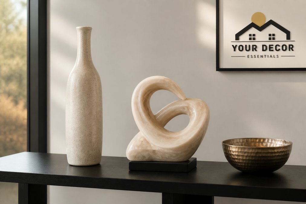
The Power of Odd Numbers
Odd-numbered groupings of three or five read as more natural to the eye than even numbers, which tend to look arranged and static. It's a small rule with an outsized effect on how settled a shelf feels.
Vary height within the group: one tall piece, one medium, one low. Vary texture too, so the cluster has something to say at every level. Avoid pairing two objects of identical height and width side by side, since the eye reads them as a mistake rather than a choice.
How to Arrange Decor on a Coffee Table
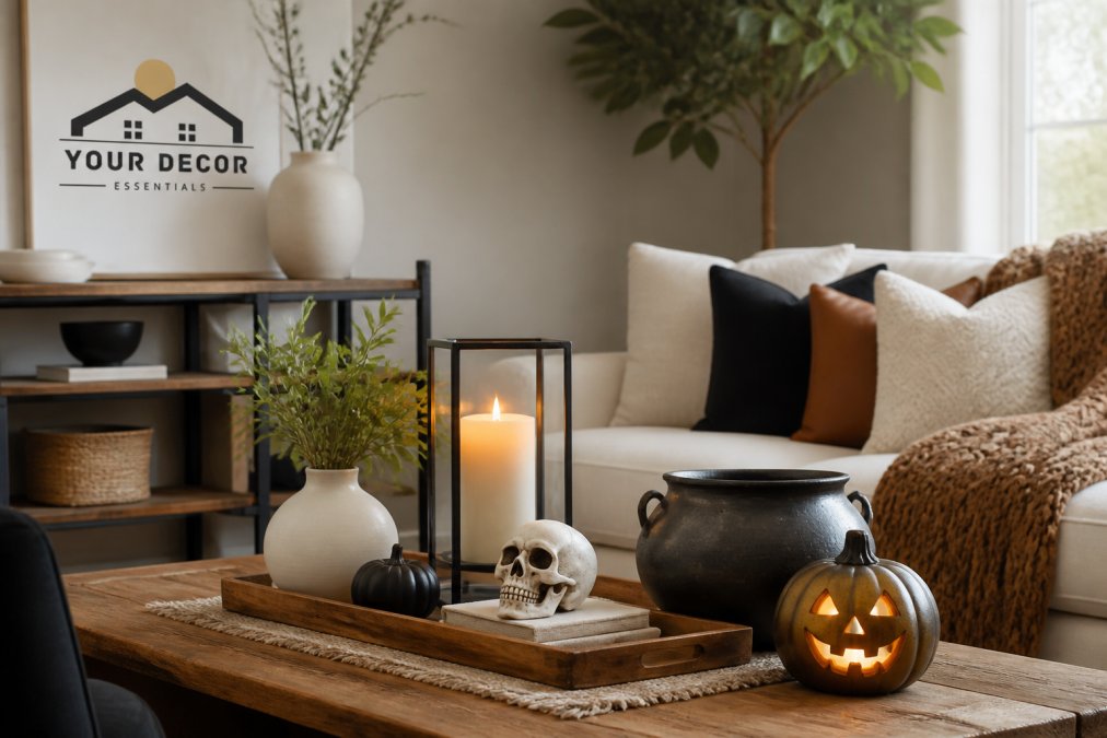
Arrange decor on a coffee table in three layers: a base, a vertical element, and a small accent. This keeps the surface functional while giving it a clear focal point.
- Start with a base. A tray, stack of books, or shallow bowl anchors the arrangement and defines its footprint.
- Add one vertical piece. A vase, candle holder, or small sculpture gives the eye a place to land.
- Finish with a low accent. A small bowl or object adds texture without blocking sightlines.
- Leave open space. Roughly a third of the table should stay clear for drinks and daily use.
- Check it from the sofa. Sit where you actually sit, then adjust height and placement from that angle.
The most common coffee table mistake is crowding. If you can't set down a cup without rearranging, you've overfilled it.
Using Lighting as a Coordination Tool
Lighting coordinates a room because it controls what the eye notices first, and most decor guides treat it as an afterthought. The mechanism is simple: light determines which colors, textures, and shapes read as connected versus disjointed. Warm light flatters wood, textile, and resin tones; harsh overhead light flattens all three.
Color Temperature: The Invisible Thread
Color temperature is measured in Kelvin (K). Most homes mix temperatures without realizing it, a cool 4000K ceiling fixture above a warm 2700K table lamp creates a subtle clash that makes even a well-planned palette feel off. The fix is to standardize on one temperature per room. For living spaces, 2700K to 3000K is the common range; it renders wood, fabric, and skin tones naturally. Kitchens and task areas often use 3000K to 3500K for clarity.
If you can't change bulbs, change what they illuminate. A cool overhead light hitting a warm-toned wall will always look slightly gray. Move the warm accent lamp closer to the wall, or add a warm-toned shade to filter the output.
Layering Light at Three Heights
Use two or three light sources at different heights instead of one bright ceiling fixture. A table lamp beside a sculpture, a floor lamp behind a chair, and a small accent light near a shelf create depth that no single overhead light can match. The goal is to eliminate flat, shadowless zones where decor pieces lose their dimension.
A practical rule: every room should have at least one light source below eye level (table lamp, floor uplight), one at eye level (sconce, shelf light), and one above (ceiling or pendant). This triangle of light makes objects at every height feel intentional.
Grazing Light for Texture
Position light so it grazes textured surfaces rather than hitting them straight on. Raking light reveals the depth in a resin piece or a woven basket, while direct light washes it out. This is the coordination tool that costs nothing to adjust and changes everything.
To test: hold a small lamp at a low angle near a textured object. If the shadows deepen and the surface detail pops, that's the angle to replicate with a permanent fixture. If the object looks flat, move the light higher or further away.
The Dimmer as a Coordination Dial
A dimmer switch is the single most underrated coordination tool. At full brightness, every object competes equally. Dimmed to 50%, the room's focal points emerge and the background recedes. This mimics the natural hierarchy the eye craves. If you can't install a dimmer, use smart bulbs with adjustable brightness, most cost less than a single new decor piece and change how every existing piece reads.
Coordinating Home Decor Pieces on a Budget
Budget coordination starts with a hard truth: most rooms already contain enough decor to look intentional. The problem is placement, not inventory. Before you buy anything, run a full audit of what you own.
The Zero-Dollar Audit
Pull every decor object from every room onto one large surface, a dining table or the floor. This includes items you've stopped noticing: the vase behind the books, the candle holder in the guest room, the tray you never use. Most homes hold 20 to 40 movable decor pieces. Seeing them together resets your eye.
Sort into four piles:
- Keep and display, pieces with strong color, texture, or shape
- Keep but relocate, items that work in a different room or height
- Repurpose, bowls as catchalls, books as risers, fabric as table runners
- Release, chipped, faded, or duplicate items that dilute the whole
A common pattern is discovering that three rooms each have a similar neutral vase. Grouping them on one shelf creates a deliberate collection; scattering them across the house reads as forgettable.
The Swap System
Once sorted, reassign pieces by color family and texture. Move the darkest object to the lightest surface, and the most textured piece to the smoothest wall. This single swap often fixes a room more than any purchase.
Work in this order:
- Pull every decor object from every room onto one surface
- Sort by color family, then by texture
- Reassign pieces to rooms where their color or texture fills a gap
- Identify what's genuinely missing before buying
- Buy one statement piece rather than three fillers
When to Buy (and What)
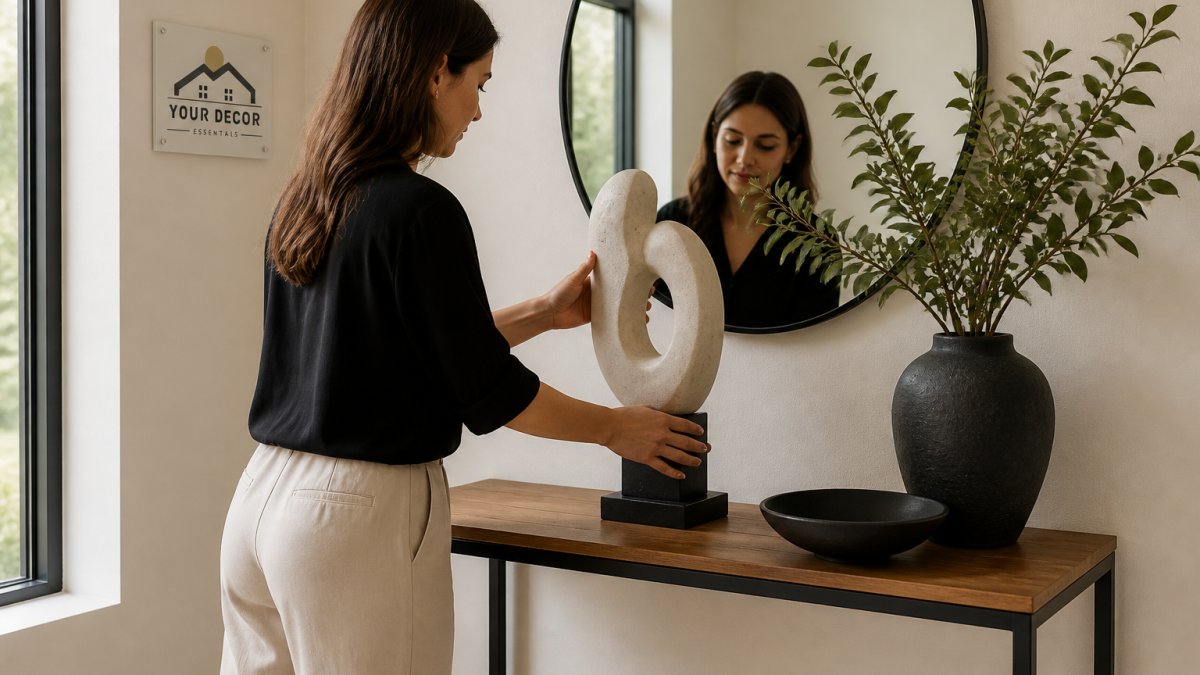
Only after the audit should you consider a purchase. The goal is to fill a specific gap, not to add volume. One well-chosen accent piece does more for a room than a cart full of small ones. A single abstract sculpture placed where the eye lands on entry can carry a whole console, and it costs less than replacing furniture you already own.
Look for pieces that bridge two existing colors or textures in the room. If your palette is warm white and muted green, a ceramic piece with both tones will tie the room together more effectively than a bright new color.
Common Mistakes to Avoid When Coordinating Home Decor Pieces
The biggest coordination mistakes are structural, not stylistic. They come from buying before planning, or from treating each purchase as an isolated decision instead of part of a whole.
Watch for these:
- Buying accents before the base. Settle your largest surfaces first, or every accent purchase becomes a gamble.
- Ignoring scale. A tiny object on a large wall or a huge one on a small shelf throws off proportion no matter how nice the piece is.
- Too many focal points. One clear focal point per room; a second competes rather than complements.
- Skipping the walk-through. View the room from the doorway, not from two feet away. Arrangements that look fine up close often fall apart at distance.
- Fear of empty space. Negative space is part of the arrangement, not a gap to fill.
Trial and error is part of the process, not a sign you're doing it wrong. Move things, live with them for a week, and adjust. Rooms that feel curated got there through iteration, not a single shopping trip.
Frequently Asked Questions
What is the 70/30 rule in decorating?
The 70/30 rule is a guideline for creating visual balance. It suggests that 70% of your room's decor should follow a consistent theme, style, or color palette, while the remaining 30% can introduce contrasting elements. For example, if your room is 70% neutral tones and classic shapes, the 30% could be a bold abstract sculpture or brightly patterned throw pillows. This ratio prevents a space from feeling monotonous or chaotic.
How do you make a room look cohesive but not matchy-matchy?
To avoid a matchy-matchy look, focus on unifying elements rather than identical pieces. Repeat a key color in different textures, like a navy blue in a velvet pillow and a ceramic vase. Mix different materials such as wood, metal, and glass. Vary the scale of your items, pairing a large piece of art with smaller accent pieces. The goal is to create a conversation between objects, not a uniform set.
How do I mix different decor styles in one room?
Start by choosing a dominant style that makes up about 70% of the room. Then, layer in pieces from a secondary style for the remaining 30%. Find common ground between the styles, such as a shared color palette or material. For instance, pair a modern, sleek sofa with a rustic, reclaimed wood coffee table. The contrast creates interest, while the shared neutral tones keep the space feeling intentional and coordinated.
What is a simple way to arrange decorative items on a shelf?
Try the rule of thirds or the 3-4-5 rule. Group items in odd numbers, like three objects of varying heights. Create a triangle shape with your arrangement by placing the tallest item in the back and two shorter items in front. Vary the textures and shapes. For example, place a tall bookend, a medium-sized sculpture, and a small bowl together. This creates a balanced, dynamic vignette that feels curated.
Coordinating a room takes patience, and it's easy to stall out halfway through. If you'd rather skip the guesswork, Your Decor Essentials curates abstract sculptures, resin accents, and functional lighting designed to introduce visual interest without clashing with what you already own. Browse the collection, pick one piece that fills the gap you identified, and see how much a single well-placed accent changes the room. Shop Now to start building a space that reflects your taste.