 how-to
How to Style a Gallery Wall With Modern Art
Table of Contents
- Start With a Clear Vision for Your Gallery Wall
- Select Modern Art and Artwork That Reflects Your Style
- Gallery Wall Layout Ideas: Planning Your Arrangement
- Using Gallery Wall Templates to Map Your Design
- Mixing Frames on a Gallery Wall for Visual Interest
- Gallery Wall Spacing: Getting the Distance Right
- Achieve Balance and Proportion in Your Display
- Hanging Your Gallery Wall: Tools and Techniques
- Common Mistakes to Avoid When Styling Modern Art
- Frequently Asked Questions
Last Updated: October 16, 2026
Start With a Clear Vision for Your Gallery Wall
A gallery wall is a curated display of framed artwork and prints arranged together on one wall to create visual impact, and learning how to style a gallery wall with modern art transforms a blank space into a stunning focal point. Before you hang a single frame, you need a clear idea of what you want your gallery wall to communicate.
Ask yourself these questions first:
- What mood do you want to create? (energetic, calm, sophisticated, eclectic)
- What's the main color palette in your room?
- Do you want the wall to feel formal or relaxed?
- Will this be a statement wall or a subtle accent?
Your vision shapes every decision that follows. A cohesive gallery wall doesn't happen by accident, it happens because you know what you're building toward. This clarity makes the rest of the process faster and easier.
Select Modern Art and Artwork That Reflects Your Style
Most gallery wall guides tell you to pick art you love and stop there. That advice is true but useless when you are standing in front of a wall with a budget and a blank space. Modern art needs a selection framework, because the movement covers everything from a single saturated color field to a dense collage of torn paper. Without a way to sort those options, you end up with a wall that looks like a sample sale rather than a collection.
Use four filters to build a modern art set that holds together. Apply them in order, and you will narrow hundreds of prints to a working group of five to nine pieces.
1. Medium and surface. Decide whether you want works on paper, canvas prints, photography, or mixed media. Medium affects how light behaves on the wall. Glossy photographic prints and acrylic glazing reflect windows and lamps, while matte paper and canvas absorb light and read softer. A common pattern is to keep one dominant medium across at least sixty percent of the wall, then introduce a second medium as contrast. Mixing every medium at once flattens the visual hierarchy.
2. Subject and visual weight. Modern art subjects fall into broad families: geometric abstraction, gestural abstraction, color field, figurative work, landscape reinterpreted, typography, and botanical or organic forms. Visual weight is separate from subject. A small, densely patterned print can carry as much weight as a large pale abstract. Sort your candidates into heavy, medium, and light visual weight before you think about placement. This step is what makes the balance section later in this article possible.
3. Palette logic. Pull the dominant colors from your room, then decide how the art will relate to them. You have three workable strategies:
- Echo: repeat two or three room colors in the art so the wall feels built-in.
- Bridge: choose art that shares one room color but adds a new accent, which keeps the wall from matching too literally.
- Contrast: introduce a complementary palette on purpose, which works best when the room is otherwise neutral.
Pick one strategy for the whole wall. Mixing echo and contrast across the same arrangement is the most common reason modern gallery walls feel disjointed.
4. Scale and edition type. Decide whether you are buying originals, limited-edition prints, or open-edition reproductions. Originals carry texture and variation but cost more and are harder to replace. Limited editions sit in between. Open-edition prints are the most flexible for gallery walls because you can size them to your layout. When you mix edition types, keep the originals at eye level where their surface detail can be seen.
A practical curation exercise: lay every candidate on the floor and remove any piece that does not share a color, a shape language, or a subject family with at least two others. What remains is your set. This is faster than trying to justify each piece individually, and it surfaces the visual thread that makes a modern wall read as intentional.
Gallery Wall Layout Ideas: Planning Your Arrangement
Layout is where your vision becomes real. A gallery wall layout determines whether your arrangement feels intentional or chaotic. The two main approaches are grid layouts and organic layouts.
Grid layouts create order. Frames are arranged in neat rows and columns, creating a structured, modern feel. This works well for minimalist spaces and creates strong visual rhythm.
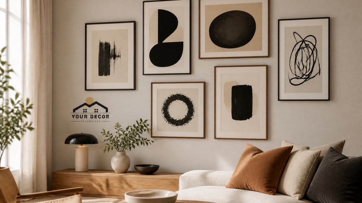
Organic layouts feel more relaxed. Frames vary in size and position, creating an asymmetrical arrangement that still feels balanced. This approach works beautifully with eclectic modern art because it mirrors how art naturally evolves over time.
Most modern gallery walls blend both approaches. You might have some structure (frames roughly aligned) with flexibility (varying sizes and spacing). This balance prevents the wall from feeling too rigid or too scattered.
Consider your room's architecture too. A long horizontal wall calls for a different arrangement than a vertical space above a sofa. Staircase walls benefit from a vertical flow that guides the eye upward. Narrow hallways work best with a tight, organized layout.
Using Gallery Wall Templates to Map Your Design
Templates remove the guesswork from gallery wall spacing. A template is a paper outline of your frames that you tape to the wall before hanging anything. This lets you see the full arrangement before you commit.
You can create templates yourself:
- Measure each frame's height and width
- Draw rectangles on kraft paper at actual size
- Cut out the rectangles
- Tape them to your wall in your planned arrangement
- Step back and evaluate before hanging
This simple step catches problems early. You might discover that your spacing feels too tight, or that a frame looks better positioned higher or lower. Templates make adjustments effortless.
Alternatively, many people sketch their arrangement on graph paper first. This helps you visualize the overall composition before touching the wall. Some prefer to lay frames on the floor and photograph the arrangement, then recreate it on the wall.
The template approach takes 30 minutes but saves hours of rehang work. It's one of the most valuable steps in the entire process.
Mixing Frames on a Gallery Wall for Visual Interest
Mixing frames is what separates a cohesive gallery wall from a monotonous one. When every frame is identical, the display feels flat. When frames vary thoughtfully, the wall gains depth and personality.
Start with a dominant frame style (perhaps black metal or natural wood), then introduce secondary styles strategically. You might combine:
- Matte black frames with brushed gold accents
- Thin metal frames with thicker wooden frames
- Polished finishes with raw, unfinished wood
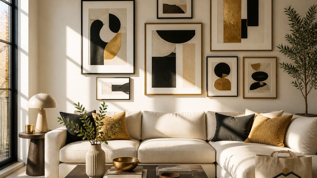
The key is balance. If you use five different frame styles, the wall becomes chaotic. Three main styles, with one clearly dominant, creates visual interest without confusion.
Consider frame width too. Thinner frames feel modern and minimal. Thicker frames create more presence. Mixing thin and thick frames adds dimension to your display.
Color matters as much as style. A gallery wall with frames in black, white, natural wood, and one unexpected color (like matte gold or deep blue) feels intentional. Random frame colors look accidental.
When you understand how to style a gallery wall with modern art, you'll find that modern art pairs beautifully with minimalist frames that don't compete with the artwork itself. Your frames should enhance the pieces, not overshadow them.
Gallery Wall Spacing: Getting the Distance Right
Spacing determines whether a gallery wall feels cohesive or scattered. Too much space between frames and the arrangement falls apart. Too little and the wall feels cramped.
The standard approach is to maintain consistent spacing between frames. Most designers use 2 to 3 inches between frames as a starting point, then adjust based on the room's size and your visual preference.
Larger rooms can handle more generous spacing. A small bedroom might feel better with frames closer together. The goal is to make the wall feel intentional rather than random.
Vertical spacing matters too. Frames should feel connected, not isolated. If you're creating a vertical gallery wall (like above a staircase), maintain consistent spacing as the eye moves up and down.
Consider the negative space around your gallery wall. Frames shouldn't be so spread out that they feel disconnected from each other. They also shouldn't be so tight that they merge into one visual block.
When in doubt, use your template to test spacing before committing. You can adjust the paper rectangles until the spacing feels right, then measure and recreate that spacing on the wall.
Achieve Balance and Proportion in Your Display
Balance doesn't mean symmetry. A perfectly symmetrical gallery wall can feel stiff. True balance means the visual weight feels even across the wall, even if the arrangement is asymmetrical.
Distribute color and visual weight evenly. If all your bold, colorful pieces are clustered on one side, the wall feels unbalanced. Spread them across the arrangement so no single area dominates visually.
Proportion is about size relationships. If you use one massive frame surrounded by tiny ones, the proportions feel off. A mix of sizes works best when the largest frame isn't more than twice the size of the smallest.
Many successful gallery walls follow the 60-30-10 rule. Sixty percent of your frames are one size (your dominant size), thirty percent are a secondary size, and ten percent are accent sizes. This creates harmony while maintaining visual interest.
The center of your gallery wall should feel like the heart of the arrangement. This doesn't mean putting the largest frame in the exact center, it means creating a focal point that draws the eye naturally.
Hanging Your Gallery Wall: Tools and Techniques
Hanging is where a good layout either survives or fails. The hardware you choose depends on three things: the weight of each frame, the wall substrate, and whether you are allowed to put holes in the wall. Work through those three variables before you pick up a drill.
Match hardware to wall type.
- Drywall with wood studs: The strongest option. Drive screws directly into studs for frames over roughly 20 pounds. For lighter frames between studs, use self-drilling drywall anchors rated above the frame weight. A stud finder and a level are the only specialty tools you need.
- Drywall without usable studs: Use expanding anchors or toggle bolts. Toggle bolts spread load behind the drywall and are the better choice for heavier frames. Follow the anchor's published weight rating and stay well under it, because ratings assume ideal installation.
- Plaster and lath: Plaster is brittle and cracks easily. Drill pilot holes at low speed, avoid hammering, and prefer anchors designed for hollow or friable walls. A common pattern is to use a small piece of painter's tape over the drill point to reduce surface chipping.
- Brick and masonry: Use masonry anchors or sleeve anchors and a masonry bit. Do not rely on adhesive strips here. Masonry walls are unforgiving of misplaced holes, so template placement matters even more.
- Rental-friendly walls: Adhesive strips and hooks work for light frames, typically under about 10 pounds, on smooth, clean, painted surfaces. They are not suitable for heavy frames, textured walls, or fresh paint. Remove them slowly and parallel to the wall to reduce paint damage. For anything heavier in a rental, consider a freestanding picture ledge or a leaning arrangement on a console rather than drilling.
Plan the holes before you make them. Your paper template is also your drilling map. Mark each hanging point on the template, tape the template to the wall, check it with a level, then drill through the marks. For two-point hangers, measure the distance between the hanger's D-rings or wire peaks on the frame itself and transfer that measurement to the template. This prevents the tilted-frame problem that ruins an otherwise good arrangement.
Control weight and movement. Use two hanging points for any frame wider than about 16 inches. A single nail lets a wide frame pivot. Add small adhesive bumpers at the bottom corners of each frame to keep it level against the wall and to protect the paint. For frames in high-traffic areas, a small strip of museum putty at the bottom corners reduces shifting from doors and footsteps.
Check level as a system, not frame by frame. Hang the center or anchor frame first, level it, then work outward. Re-check the whole arrangement with a long level or a laser level after every two or three frames. Small errors compound across a wall, and a wall that is level frame by frame can still read as drifting when viewed from across the room.
Test before you trust. After hanging, press gently on each frame's top edge. It should not rock, slide, or pull away from the wall. If it does, move to a stronger anchor rather than adding a second weak one. For heavy or valuable pieces, a professional hanging service is worth the cost compared with repairing drywall and replacing glass.
Common Mistakes to Avoid When Styling Modern Art
The most common mistake is treating a gallery wall like a bulletin board. Tacking up art as you acquire it creates a cluttered, unintentional look. Instead, plan the entire arrangement before hanging anything.
Another frequent error is mixing too many styles. Five different frame styles, three different mat colors, and artwork spanning every aesthetic creates visual chaos. Limit yourself to a clear style direction.
Spacing inconsistency breaks a gallery wall's flow. If spacing varies wildly across the arrangement, the wall feels disorganized. Use your template to keep spacing consistent.
Poor lighting ruins even beautiful artwork. If your gallery wall lives in shadow, the pieces disappear visually. Position it where natural or artificial light can highlight the frames and artwork.
Hanging too high or too low throws off the entire composition. The center of your gallery wall should be at eye level (around 57 inches from the floor). This creates a natural focal point that feels balanced.
Finally, avoid the impulse to overcrowd. A gallery wall doesn't need to cover every inch of wall space. Generous negative space around your arrangement makes it feel intentional and modern.
Frequently Asked Questions
How do you arrange modern art on a gallery wall?
Start by laying out your artwork on the floor to test arrangements before hanging. Choose a layout style, grid, linear, or asymmetrical, based on your space and art collection. Modern art works best when you balance scale, color, and visual weight across the wall. Ensure pieces relate thematically through color palette or style, then space them consistently. Odd numbers of pieces and varying frame styles create a more intentional, curated look that complements modern interiors.
What spacing should you use between gallery wall frames?
Maintain consistent spacing of 2 to 3 inches between frames for a cohesive gallery wall. This distance creates visual rhythm without making pieces feel disconnected. For asymmetrical layouts, spacing can vary slightly to accommodate the organic arrangement, but consistency in at least some areas prevents the display from looking chaotic. Measure twice before hanging to ensure even gaps, which significantly impact the overall polish of your display.
How do you choose modern art that looks cohesive together?
Select pieces that share a common thread: a consistent color palette, similar subject matter, matching frame finishes, or a unified style. Modern art benefits from a cohesive look when pieces speak the same visual language, whether minimalist, abstract, or bold and graphic. Mix sizes and frame styles, but ensure the artwork itself connects thematically. Consider your room's existing décor and choose art that complements rather than competes with your furniture and wall color.
Can you mix different frame styles on a gallery wall?
Yes, mixing frames on a gallery wall creates visual interest and a more personalized, curated aesthetic. Combine frame finishes like wood, metal, and painted frames, but maintain harmony through color, stick to a palette of two or three finishes. Vary frame widths and styles while keeping the overall arrangement intentional. Modern design embraces eclecticism, so mixing frames works well as long as the artwork inside maintains visual cohesion through color or theme.
Creating a gallery wall with modern art transforms a blank wall into a reflection of your style. Your Decor Essentials offers a curated selection of abstract sculptures, framed art prints, and modern decor pieces designed to work beautifully together. Our collection helps you build a gallery wall that feels personal, intentional, and distinctly yours. Shop Now to explore pieces that will make your vision come to life.